Our clients purchased this 4 bedroom, 3-1/2 bath waterfront home on Lake Conroe in Conroe, TX. The home was a gem when it was built in 1997, but it needed a little polish and shine. Our clients have three kids and love to entertain. They are a laid-back and fun family, so the interior needed to be welcoming, durable, and kid-friendly. They gave free design reign over the entire home with one request: they wanted it to be “steampunk.” This is a design style inspired by 19th-century industrial steam-powered machinery. The clients love this quirky look and wanted it incorporated into their decor.
The design dilemma was to merge the two very different styles: steampunk and lake house. This was a challenge I was excited to take on! As you peruse the photos, I think you’ll see the ways we incorporated the steampunk elements by way of lighting, plumbing fixtures and accessories. We found many vintage and upcycled items, such as a motorcycle-gas-tank-turned-art, a bowler hat, bicycle seats and taxidermy. These items were then juxtaposed by all of the lake elements: casual linens, natural and raw elements, and an array of blues.
You’ll notice the foyer previously had 20-foot ceilings with an upstairs landing that overlooked the front door. We decided to close it in. This achieved several things: it added square footage to the house (increasing its value), added another room upstairs, and created more of a sound barrier between floors. You’ll also notice, we were able to repurpose the coat closet into a downstairs powder room. The stairway was modernized with iron railing and wood treads and risers. An industrial light was added, along with updated flooring throughout the home.
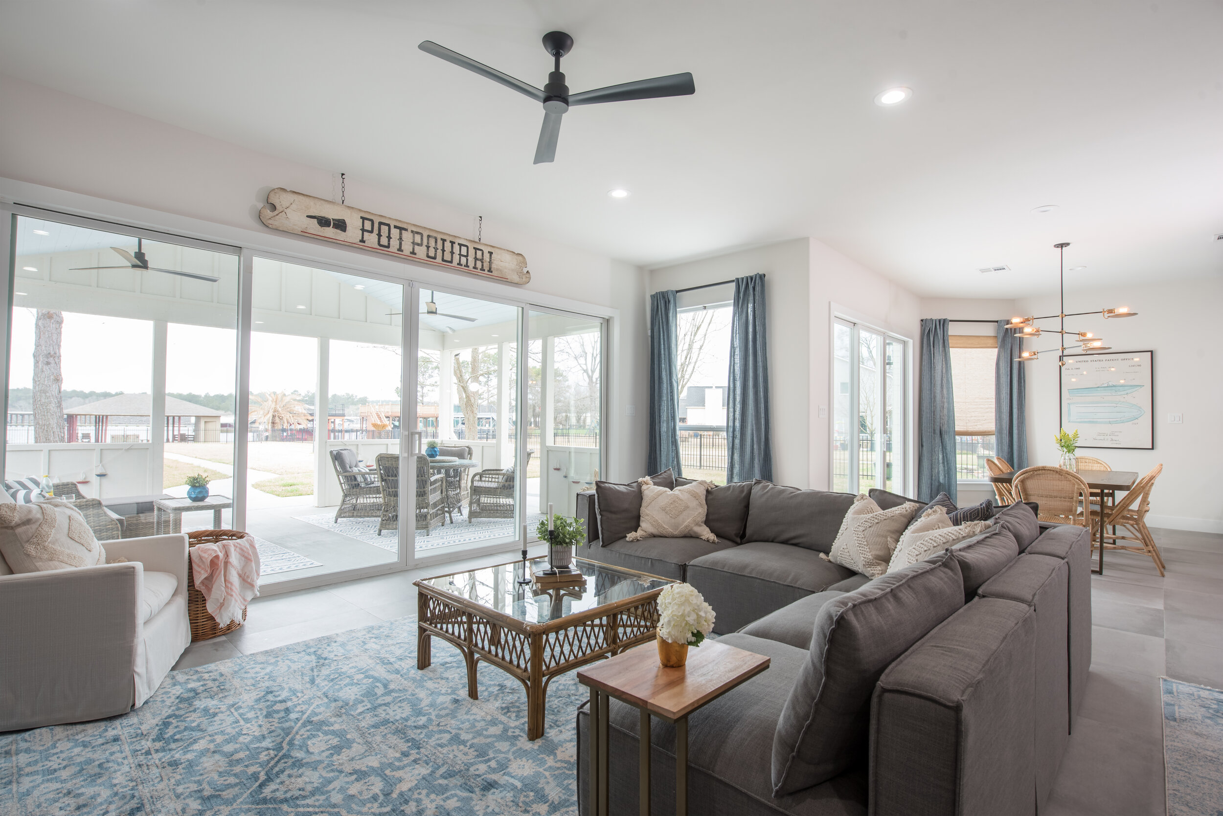
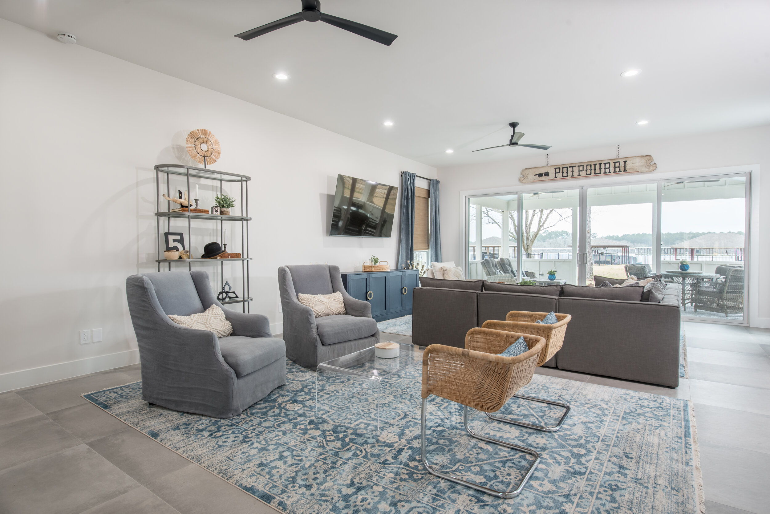
In the family room, we removed the fireplace and pushed the exterior wall out to the end of the existing covered porch. This created an oversized living space that allowed for two separate seating areas. Expansive glass sliding doors were also added in the family room and dining room to maximize the lake view.
We utilized the space under the staircase for an adorable “Harry Potter Room.” Any chance I get, I love to carve out fun nooks and crannies for kids spaces.
In the kitchen, the original pantry was replaced with an oversized refrigerator and freezer. A larger walk-in pantry was created by repurposing space from the new kitchen layout. A butler’s pantry was added, utilizing even more of the unused space under the staircase. We removed the kitchen window and relocated the sink to the island in order to help bring more attention to the hood and range.
The Dining Room space also benefitted from the expansion of the exterior wall. A sliding glass door was added, as well as an asymmetrical, modern light fixture. The wicker chairs continue the light, airy lake feel into this room.
One favorite detail is the boat art, pulling in the lake vibes and the blue theme.
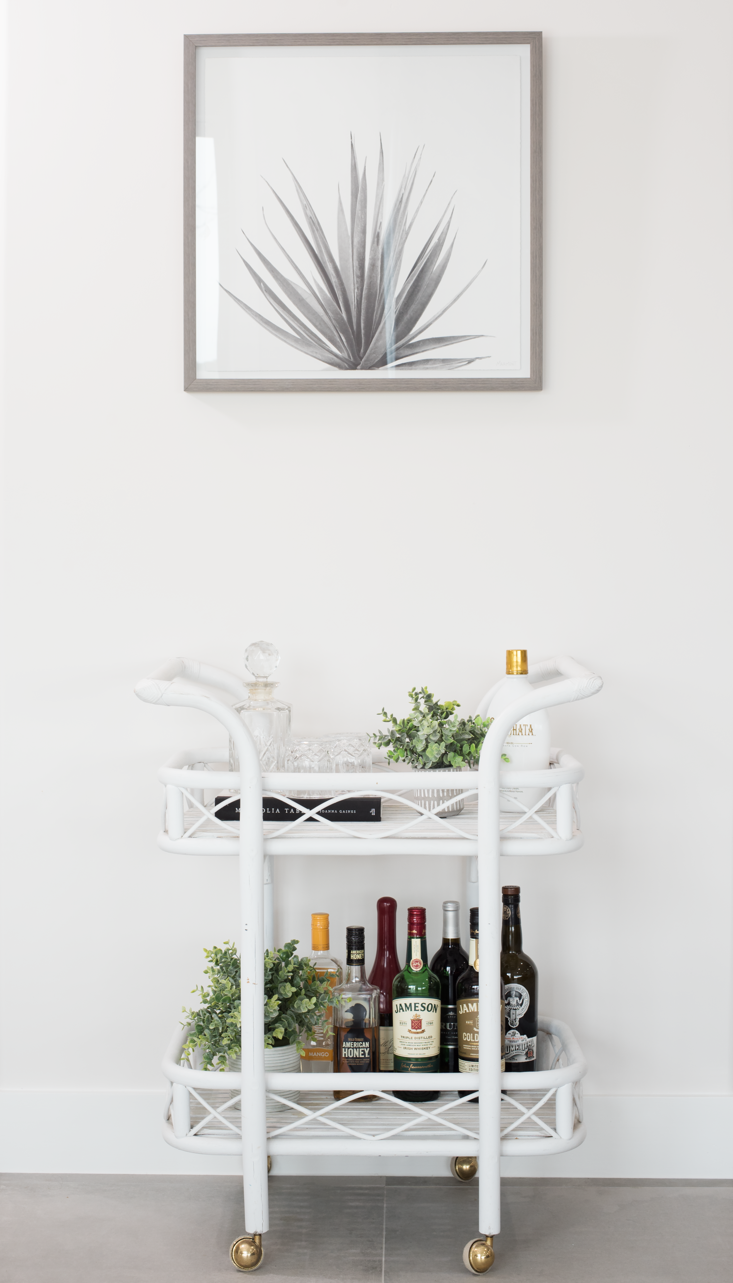
Between the Dining room and the family room is this darling bar cart.
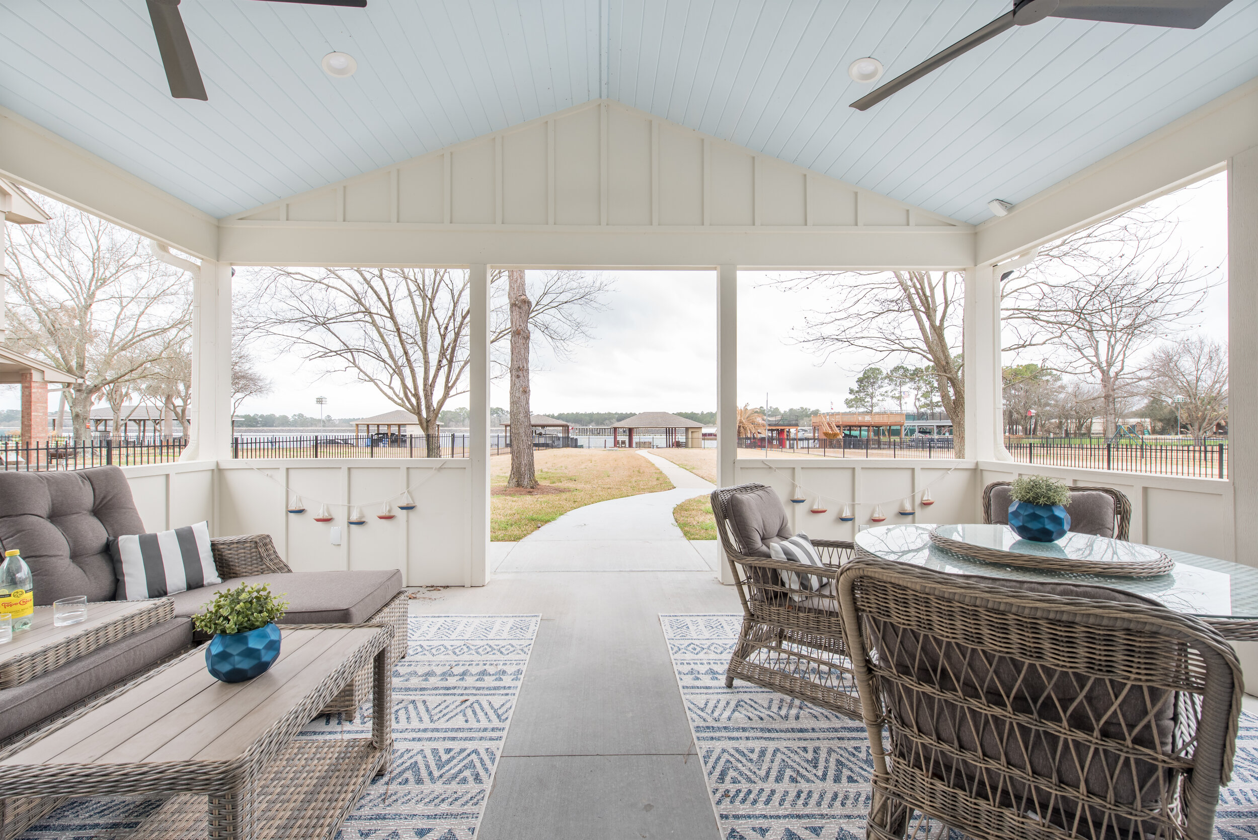
The covered lanai was transformed into an outdoor oasis, including outdoor seating and dining with matching cozy rugs.
In the master suite, we added windows and a sliding door, allowing for more natural light and lakefront views. The dual flooring materials broke up the space and made it feel smaller, so we replaced them with the same flooring used throughout the first floor. The bed was moved to a different wall, where we added a blue and metallic wallpaper.
In the all-black-and-white master bathroom, we changed the orientation of the water closet and removed the jacuzzi tub, replacing it with a large shower.
I mentioned how fun these clients are, and you’ll see their sense of humor showing through in the candid message “get naked“ in the tile design!
A freestanding tub was added on the back wall, creating an inviting space to unwind and relax.
The upstairs has a game room with four bedrooms and two bathrooms. By extending the back wall of the game room to match the newly-captured family room space below, we were able to add a stage to compliment the large sitting area.
One of the upstairs bedrooms was converted into a comfortable, inviting guest suite that doubles as a home office.
The Jack and Jill bath received a complete makeover.
In the daughter’s bedroom, we built the color pallet of the room around the fine art piece above her bed: turquoise, orange, and pink. A vanity area was added with an orange stool. The turquoise made an appearance in her Jenny Lind bed and drapery. The leopard print rug and white fur bedding added a touch of whimsy.
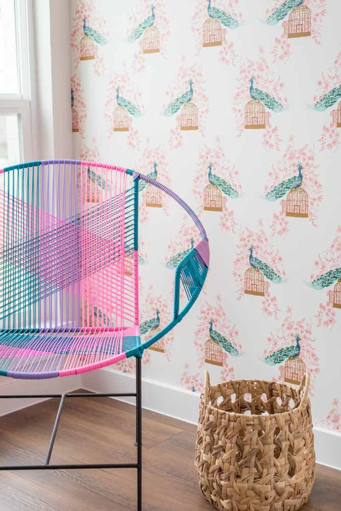
And, check out her darling reading nook/closet!
In the oldest son’s room, we went with an orange, navy and grey color pallet. Texture was added with a “wave” patterned wallpaper. Orange lockers were used as night stands and provided additional storage.
His en suite bath also received a complete facelift. We brought the navy into his bathroom, as well, with the navy tile and vanity.
And, remember the room we gained by closing in the foyer? This petite, adorable nursery is the result.
We hope you enjoyed your tour of our #steampunklake project!


