This house is getting lots of LOVE on social media so it is my pleasure to give you guys an official tour via the blog! Because we truly got to be a part of every room in the house, we have A LOT to show you. We’ll be revealing it in 3 parts, the exterior and the interior parts I & II. We’ve already given a the tour of the exterior, so if you missed that click here. Now let’s move on to the interior part I which will cover most of the first floor.
Let me start by saying that this house was a huge collaboration and only turned out as fabulous as it did because so many talented people came together. The plan design was done by Wyrick Residential Design, it was built by Blakecraft Homes, the landscape and pool design was done by Smelek Design, and the beautiful photos you’re about to enjoy were captured by Grant Duckworth Photography. Duckworth Interiors provided the construction selections as well as the turn-key interior.
Come on in…
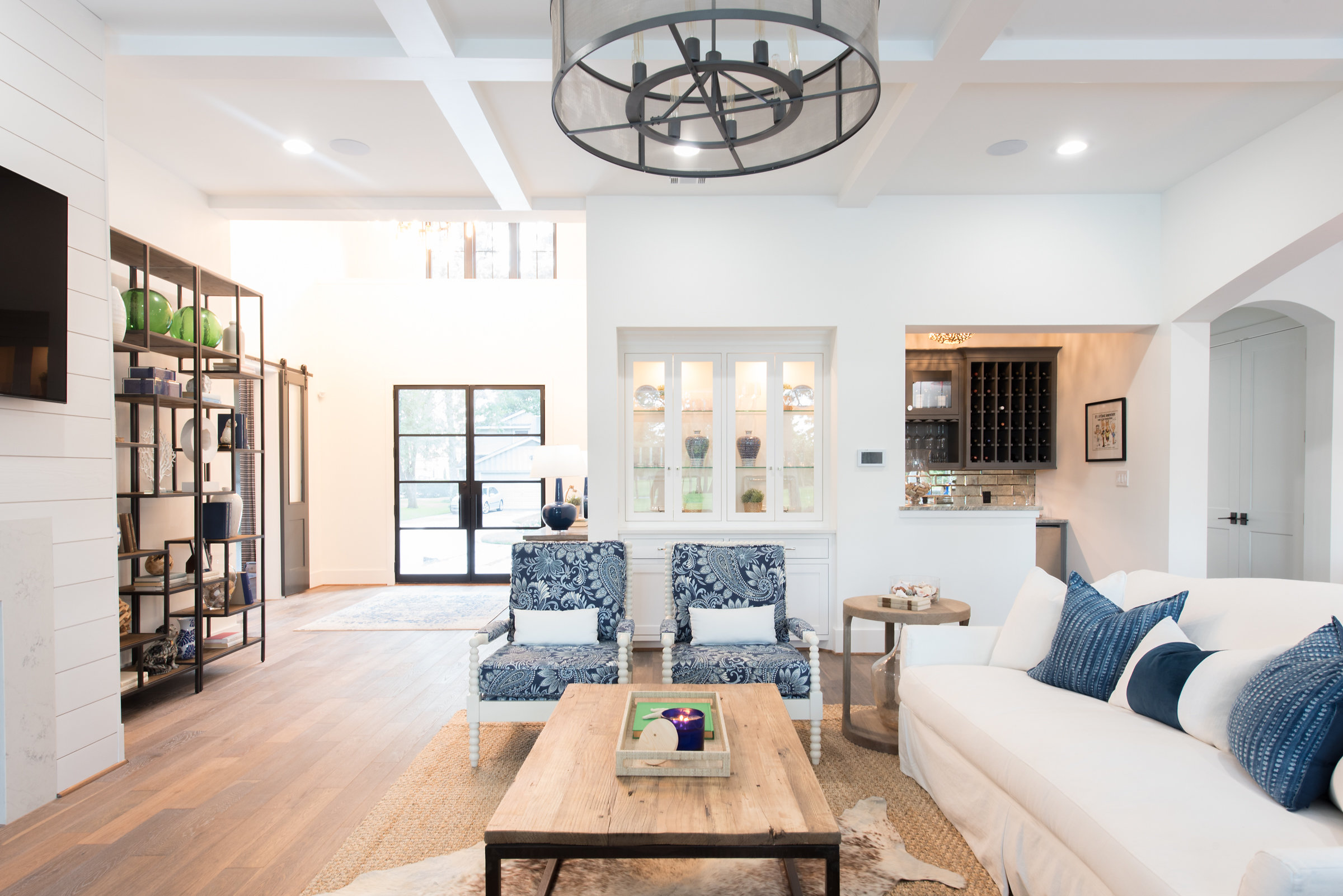
When you first walk in this home, it’s truly so delightful you don’t know where to look first. After you finish getting over the AMAZING front doors you might look UP to appreciate just how large this foyer is!
When you look up, you will not be disappointed by the view!! This tray ceiling with painted v-groove and stained beams is just the backdrop for this elegantly industrial chandelier. If you love Edison bulbs, well, this one’s for you!
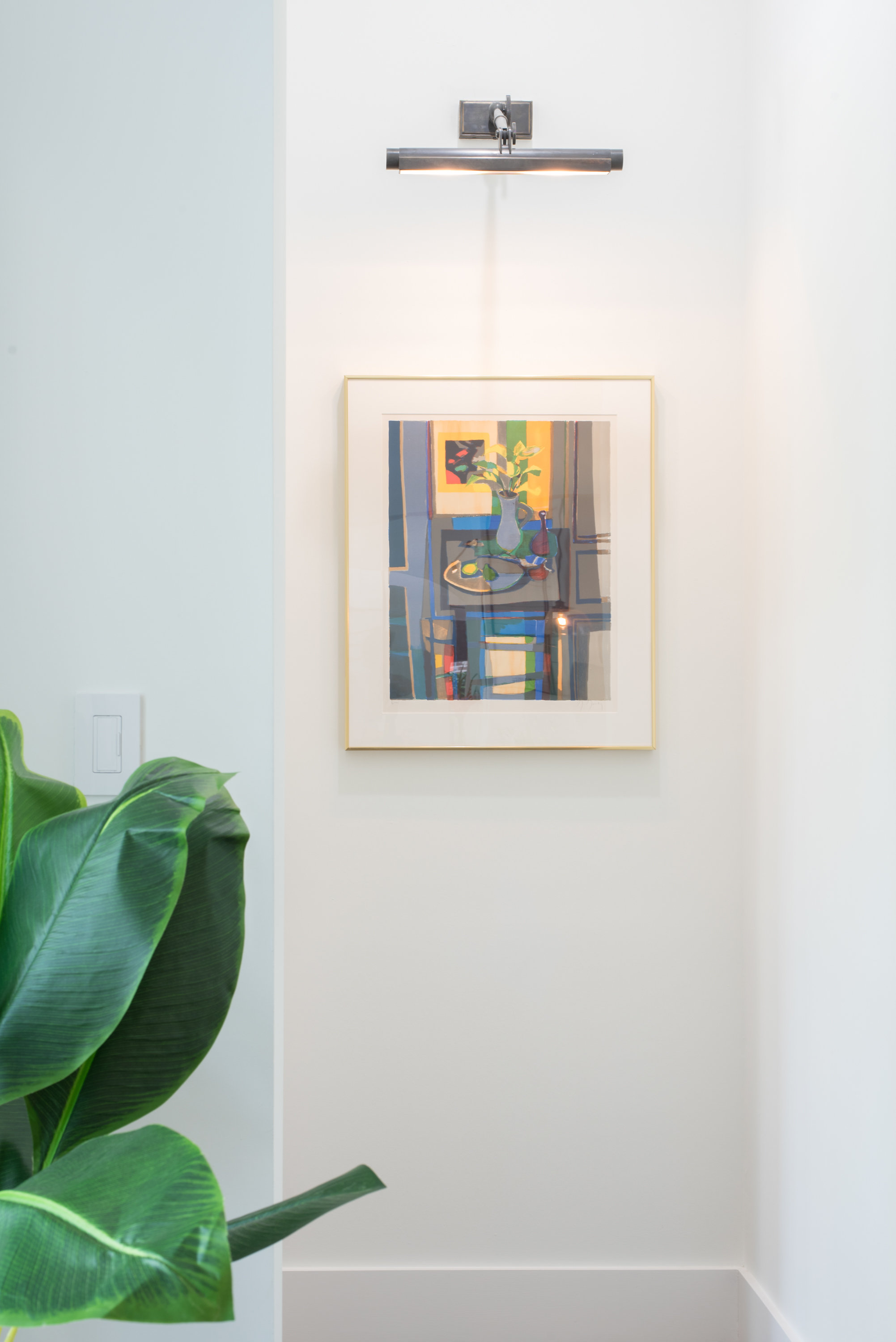
Next you might look to your left and see this great vignette. This art piece is one of my most favorites in the house. It just looked at me and said, “You must procure me for the modern coastal project!”
Turn right and you see the fully functioning study. The man of the house works from home and this study needed to be beautiful but really practical. He’s also an avid golfer and former golf pro so he really wanted a study to display trophies, prints and memorabilia from over the years. We’ve all seen the dated “golf study” so it was time for a fresh, non-stuffy take on it.
We move from the foyer to the family room…
In doing so, you have to walk past this amazing bookcase, and you have to stop and admire it for a moment. This is typically a place (next to the fireplace) where people put a built-in. I’m a big fan of leaving some spaces for unique pieces of furniture. You have more flexibility with the space and usually end up with something more visually interesting.
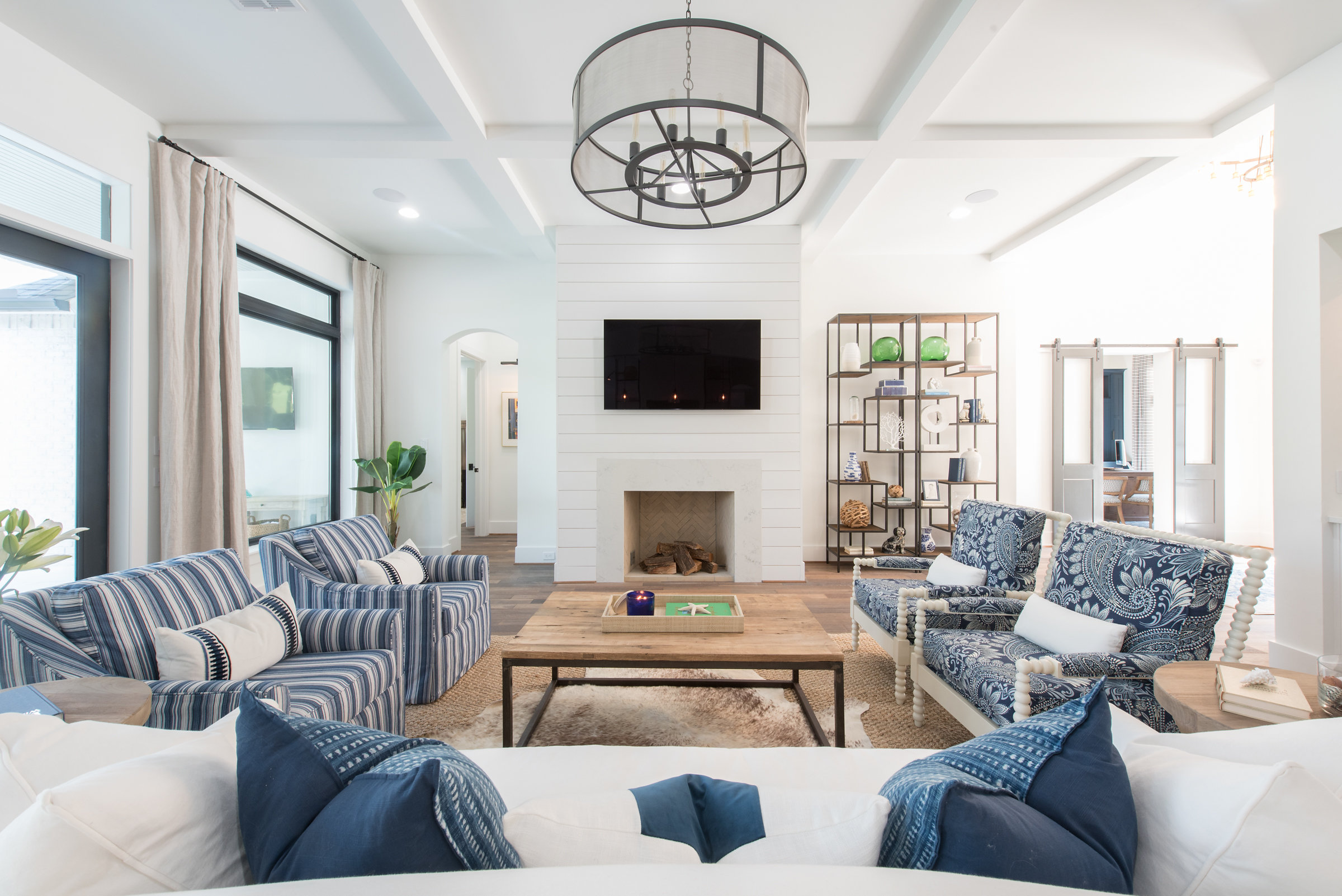
Oh, this family room… you just really feel like you’re on vacation in here. And who doesn’t want that???
Here you’ll notice a coffered ceiling. A simple shiplap clad fireplace. The firebox has a herringbone brick and the firebox surround is the same quartz material we used on the kitchen perimeter. Another great industrial light fixture.
In this little alcove that leads to the master suit, we’ve got an awesome art light and beautiful piece from the homeowners’ collection.
Our drapes are a slouchy linen.
The upholstery and pillows are all white and blue.
We have a seagrass rug layered with a cow hide, and the tables are reminiscent of driftwood.
If you venture just past the built-in china cabinet, you might find a spot you don’t want to leave… the BAR!
Did I mention these homeowners like to have fun? Pour yourself a drink… there’s lots to choose from and check out the awesome groin vault and light fixture above. Run your hand across this really unique countertop, a leathered quartzite and admire the way the light sparkles in the antique mirror backsplash.
THE KITCHEN! Lots to see here, where to begin? When we went to the candy store, I mean the granite yard, the homeowners and I really fell in love with this island material, which is a quartzite called Sea Pearl. We searched high and low to find the material in the size, thickness and finish that we needed. This material inspired the island color, and the backsplash. In fact, we loved it so much, we wanted to give it a white backdrop in order for it to command the attention. Shiplap on the hood wall is friends with the shiplap on the fireplace. A gorgeous beam is set into the stucco hood.
Adjacent to the kitchen is the gorgeous dining room. I skipped the rug here on purpose. Don’t be afraid of these white chairs in the dining room… they’re actually outdoor fabric!
Imagine dining here and looking out onto that stunning view! Can we talk about these pendants for a second? I’m obsessed. They’re my favorite lights in the house!
To the left of the dining area, we have this awesome serving area with a special gift for the lady of the house. She had admired this photographer’s work (Gray Malin) for a long time and had always wanted to own one of his pieces. I conspired with her husband and daughter to select and purchase it with out her knowledge. The first time she saw it was on reveal day! I love getting to be a part of these special moments!
Just off the dining room the guests have easy access to this beautiful powder bath. This blue and metallic wallpaper is such a compliment for the concrete sink.
Besides the master suite, which I’ll show you in my next post, there is one guest bedroom downstairs, and it’s so inviting!
I hope you enjoyed Part I of the interior tour! Leave us a note and let us know what you think! Please subscribe so you won’t miss out when we reveal Part II of this project!


