Conference Room
One of our clients owns a nationwide equipment rental company. He purchased an old used car dealership to convert into the corporate offices. After completing his personal home, he invited us to tackle this second project for him and MAN, was it fun!
First of all, I need you guys to see what we started with. These are some pics after the walls had been painted and floors were removed. I wish I could find the first before pics, but these will have to do.
Yeah. Lots of vinyl composition tile, commercial grade carpet, really just your basic, boring commercial space. The first change we requested was ripping up all the vinyl and carpet and polishing the concrete.
Reception, front desk
We asked for this superficial wall to be added so we'd have a backdrop for the reception desk and a way to divide the reception and cubicle areas. We also needed a logo wall and I think this one turned out nicely. We designed the reception desk and had it wrapped in reclaimed wood.
Reception, waiting area
Adjacent to the reception desk is this awesome waiting area.
Reception, beverage bar
Across from the waiting area is this beverage bar, which we also designed. The countertops you see throughout are Samsung quartz which is a highly durable man made product. We wrapped the countertop on the ends of the cabinets as well and mitered the corners.
Cubicles
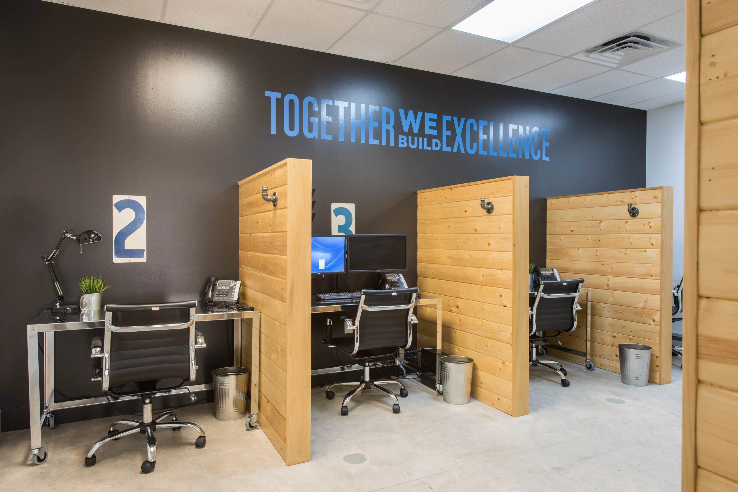
I LOVE how the cubicles turned out!! These cubicles were super cost effective and they're the best looking ones I've seen. The company is totally paperless... WHAT?! I know, something to aspire to.
Cubicles
The paperless approach really allowed for simple, clean work spaces. Side note, the numbers above each cubicle are from an old gas station- they marked each pump. :)
Break area
We added a little kitchenette for lunch time and we're kind of in love with how this stainless steel hex backsplash turned out. We grouted it in black for some contrast!
Restrooms
We totally updated the bathrooms with textured black tile on the floors, subway tile on the walls, awesome plumbing and lighting fixtures and matte black stall partitions. I know you're going to ask so the big players here are... light: Hudson Valley, sink: Kohler, and faucet: Rohl.
Lounge
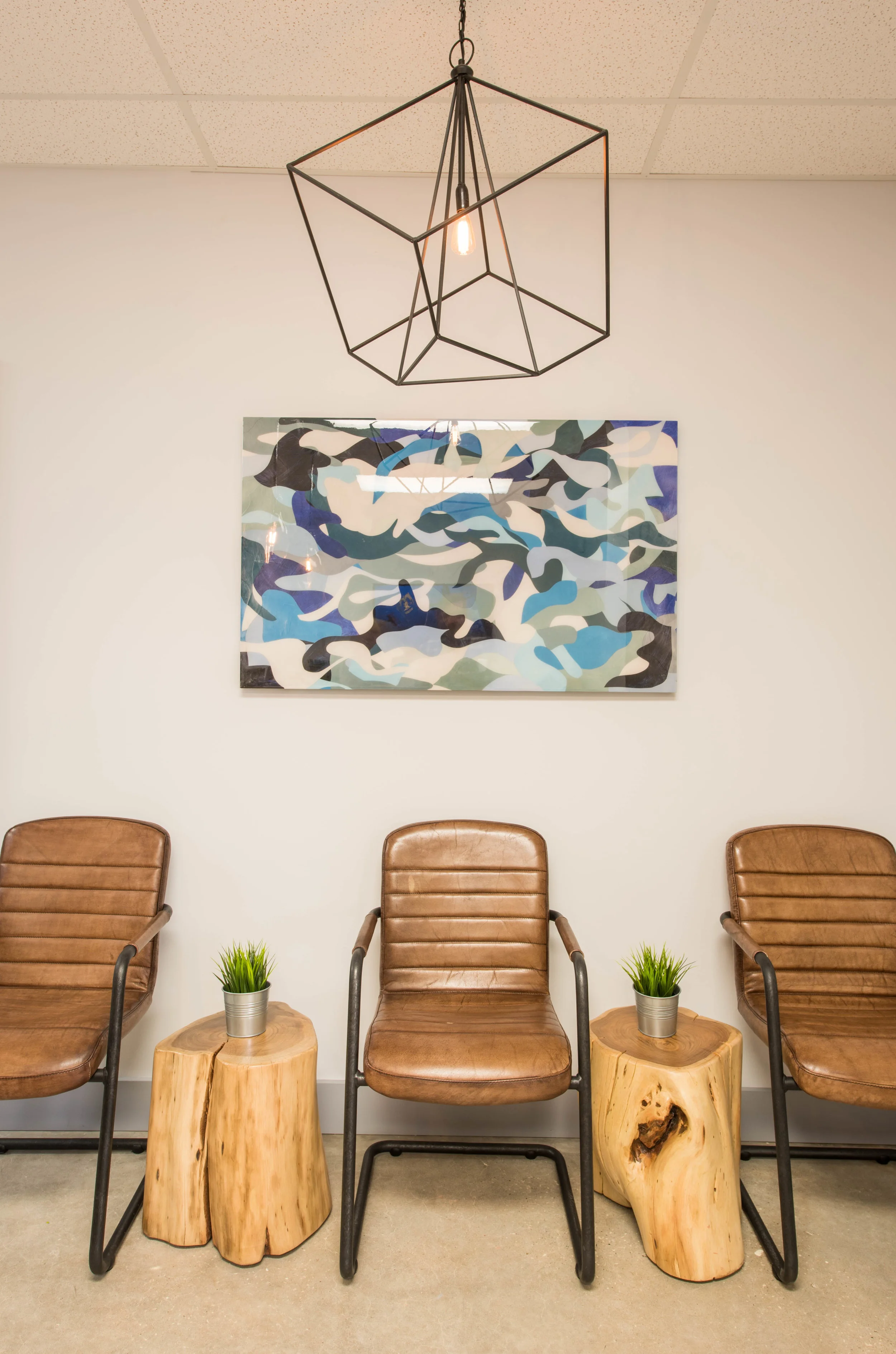
This is a great little lounge area outside of the conference room. It's a place to hang out before the meeting starts or a place to step out and take a phone call during the meeting. Yes, that light fixture is made out of a pulley.
Executive office
This office was designed for a #girlboss, so we got to have some fun in here. It's a little more feminine than the other offices and we love it!
Owner's office
The owner is a wine enthusiast to say the least! So we really embraced the wine theme. We had his desk custom made (by my dad) to incorporate wine barrels for the base. Thanks, dad! The wallpaper is wine labels and the light fixture is a collection of wine bottles with Edison bulbs.
Conference room
The conference room is by far my favorite of the spaces. We have a custom beverage bar with the company's mission statement above, awesome console table with live edge wood with tv above, and another wall that serves two purposes. It has a giant glass marker board and a projector screens comes down over it when needed for presentations.
Conference room
The centerpiece of this conference room is the conference table itself which was custom made for this project by James Ramsey with Refine Manufacturing & Design. We asked for unpainted I-beams for the base and a walnut top. Awesome work, James!
Art installation
Do you ever have an idea that's so good, you can't believe you came up with it? And then when you go to execute it, it turns out better than you imagined in your head? No? Me neither, except for this day. This one day, I was touring one of the company's facilities and I came across this long bristle brush that goes on the front of one of their pieces of equipment. I don't even know what these are called but I thought, "What if we unstack these suckers and hang them on the wall?!" So we did that. We painted the wall black and added some accent lighting. They were a challenge to hang but I love the amazing 3-D, textural impact they have. They draw you into the room. You want to touch them. Best art installation ever.
Executive office
Call me cheesy, call me kitschy, call me whatever you want but I couldn't resist. This is an EQUIPMENT RENTAL COMPANY. How perfect is this? And just for the record, I didn't steal the sign.
I hope you enjoyed checking this project out! I really love commercial spaces and hope to get my hands on more of them soon. Also, special thanks to I-45 Signs for all of the vinyl decals throughout the project and New Luxe Bath Glass for the custom marker boards.
What's your favorite part??


